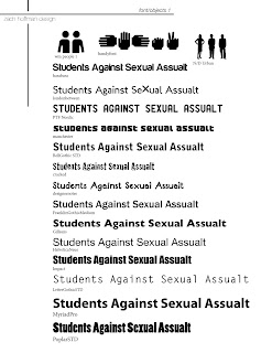
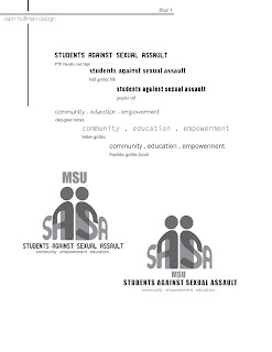
I was asked by my friend Elizabeth if I would redesign the SASA logo. I decided to take the job. Something a little more wholsome and something to keep me busy. The client wanted something new for the organization. The logo they had was good but getting a little dated. I chose to use iconic symbols we see every day merged with the dominance achieved by playing with perspective. So here is what I came up with. I tried to take a real professional approach and used the workflow I established during my time as an intern with DUZ Creative. I think it went well and the client seems happy with the results.
Here is the original logo...
Here is the finished (almost) logo.....


No comments:
Post a Comment